

Font styles play a critical role in how we perceive and interact with written information. They go beyond just aesthetics and can significantly impact.
Importance of Font Styles:
Readability:
The right font style can make text easier or harder to read. Serif fonts with their small details aid readability in printed text, especially at small sizes. Conversely, sans serif fonts excel on screens and at large sizes due to their clean lines.
Information Hierarchy:
Font styles can be used to guide a reader’s eye and emphasize important information. Using a larger, bolder font for headlines or keywords helps them stand out from body text.
Mood and Tone:
Fonts have personalities! A playful script font creates a different mood than a traditional serif font. Choosing the right style can set the tone for your message, whether it’s serious, whimsical, elegant, or anything in between.
Brand Identity:
Fonts can become a signature element of a brand. Think about Coca-Cola’s script or Disney’s whimsical font. A consistent font style across marketing materials strengthens brand recognition.
Here’s a quick breakdown:
Clear Communication: Readable fonts ensure your message is understood easily.
Guiding the Reader: Font styles help navigate content by highlighting key points.
Setting the Tone: Fonts establish the mood and feeling you want to convey.
Building a Brand: A consistent font style reinforces brand identity.
font styles are not just about visual appeal. They are a powerful tool for designers and writers to enhance communication, establish tone, and create a memorable impact.
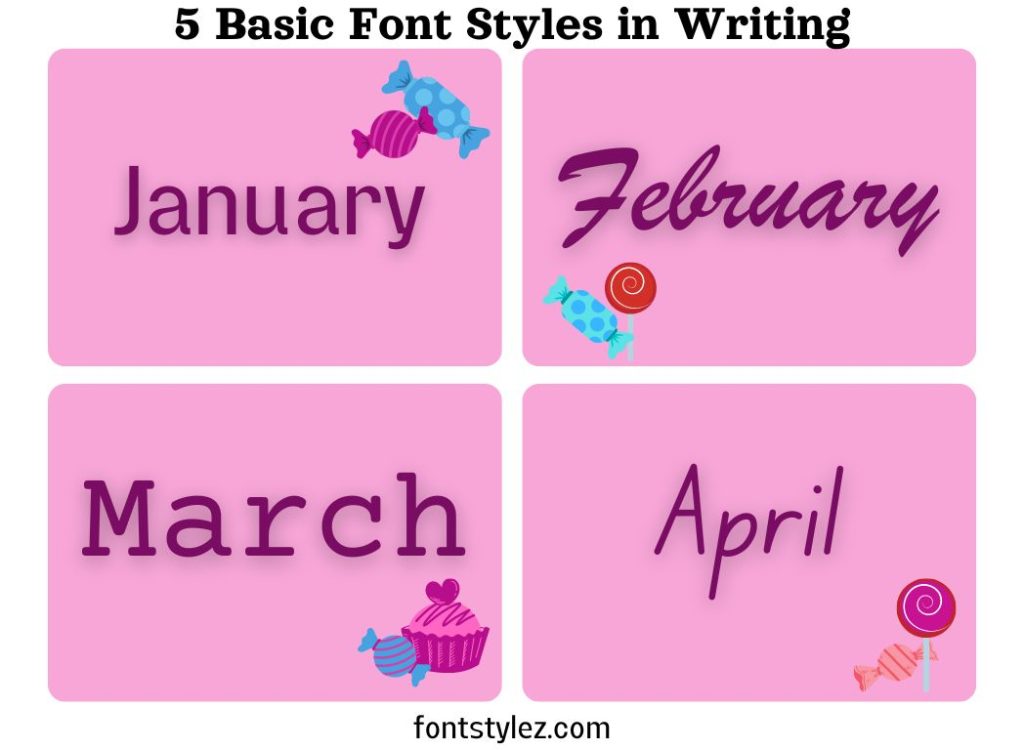
5 Basic Fonts Used in Writing :
Serif Fonts:
Importance: Serif fonts hold a significant importance in typography, conveying a sense of tradition, formality, and elegance. The defining characteristic of serif fonts is the presence of small details known as serifs, which are the little feet at the ends of strokes. These serifs play a crucial role in improving readability, particularly in printed text and at smaller sizes. By providing visual anchors for the letters, serifs guide the eye along the text, enhancing the flow of reading and reducing eye fatigue.
Where to Use: Serif fonts find their ideal usage in a variety of contexts. They are particularly well-suited for body text in books, newspapers, magazines, and other printed materials due to their readability advantages. The traditional and formal aesthetic of serif fonts also makes them a fitting choice for formal documents such as resumes, academic papers, and business reports. Additionally, serif fonts add a touch of sophistication to invitations, certificates, and other special occasions. Moreover, serif fonts can be effectively utilized in logos to evoke a sense of reliability, heritage, and professionalism.
Historical Background: The historical background of serif fonts traces back to the earliest days of printing, when letters were meticulously carved into stone or cast in metal. These early typefaces featured serifs as a practical consideration, aiding the engraving process and enhancing legibility on rough surfaces. Over time, serif fonts evolved and diversified, with various styles emerging to suit different printing techniques and design preferences. Today, serif fonts continue to be widely used and appreciated for their timeless elegance and proven readability. Some of the most popular serif fonts include Times New Roman, renowned for its ubiquity in newspapers and academic publications, Georgia, known for its digital clarity and readability, and Garamond, prized for its classic elegance and versatility across print and digital media.
Sans Serif Fonts:
Importance: Sans serif fonts, meaning “without serif,” play a crucial role in modern typography, projecting a clean, contemporary, and minimalist aesthetic. Their simplicity makes them highly readable, particularly on screens and at larger sizes. Unlike serif fonts, sans serif fonts lack the small decorative strokes known as serifs, resulting in a sleek and straightforward appearance that aligns well with modern design principles.
Where to Use: Sans serif fonts find widespread usage across various digital and print contexts. They are particularly well-suited for headlines, website content, user interfaces, and branding, where their clean lines and modern look contribute to a polished and professional appearance. Sans serif fonts excel in conveying information clearly and efficiently, making them a popular choice for digital platforms and contemporary design projects.
Historical Background: The historical background of sans serif fonts dates back to the late 19th century, when they emerged as a response to the growing industrialization and modernization of society. As the demand for clear and legible typefaces increased, sans serif fonts offered a more streamlined and industrial alternative to the traditional serif fonts. Their simplicity and straightforwardness made them well-suited for signage, advertising, and other applications where clarity and efficiency were paramount.
Several iconic sans serif fonts have become synonymous with modern typography. Helvetica, originally developed in the 1950s, is renowned for its versatility, neutrality, and widespread use in branding, signage, and graphic design. Arial, a digital adaptation of Helvetica, became a staple typeface in Microsoft operating systems and is commonly used for digital content. Proxima Soft is another notable example, known for its contemporary appearance and humanist characteristics, making it suitable for both digital and print applications.
Script Fonts:
Importance: Script fonts play a pivotal role in graphic design, offering a unique blend of personality, elegance, and decorative flair. These fonts are designed to mimic handwriting, imbuing designs with a personal touch and adding a distinctive element that can evoke various moods and styles depending on the chosen font.
One of the key strengths of script fonts lies in their versatility. They can convey a sense of elegance and sophistication, making them ideal for formal invitations, wedding stationery, and upscale branding. Conversely, script fonts can also exude playfulness and whimsy, perfectly suited for creative projects, children’s materials, or informal communication. Moreover, depending on the specific style of the script font, it can evoke nostalgia, romance, or even a sense of vintage charm, allowing designers to tailor the mood of their designs accordingly.
Where to Use: It’s important to use script fonts sparingly and strategically. Due to their intricate and ornate nature, they are best reserved for headlines, logos, short bursts of text, or as accents within a design. Overuse of script fonts can overwhelm the reader and diminish readability, detracting from the overall effectiveness of the design.
Historical Background: The historical background of script fonts traces back centuries, with roots in calligraphy and decorative lettering traditions. Historically, skilled scribes would painstakingly craft elaborate script letterforms by hand, showcasing their mastery of the art form. These ornate scripts adorned manuscripts, religious texts, and other important documents, adding a sense of prestige and importance to the written word.
In the digital age, script fonts have experienced a resurgence in popularity, thanks to the vast variety of font styles available and the ease of access provided by digital typography. Designers now have access to a plethora of script fonts, ranging from classic and elegant scripts to modern and whimsical styles, allowing for greater creativity and expression in design projects.
Decorative Fonts:
Importance: Decorative fonts play a crucial role in graphic design, offering a diverse array of styles that can instantly grab attention and infuse projects with personality and flair. These fonts are meticulously crafted to stand out and make a statement, ranging from whimsical and playful to vintage and grungy, allowing designers to evoke specific moods and themes in their designs.
One of the key strengths of decorative fonts lies in their ability to add visual interest and uniqueness to a project. Whether it’s a bold and eye-catching headline, a stylized logo, or a creative typographic composition, decorative fonts can instantly elevate the overall design and capture the viewer’s attention. By selecting the appropriate decorative font, designers can reinforce the message or theme of their project, creating a memorable and impactful visual experience.
Where to Use: However, it’s important to use decorative fonts sparingly and strategically. Due to their ornate and intricate nature, they are best suited for headlines, logos, or short bursts of text where they can shine and command attention. In large blocks of text, decorative fonts can be challenging to read and may detract from the readability of the content, so they are typically reserved for display purposes rather than body text.
Historical Background: The historical background of decorative fonts can be traced back to the early days of typography when typefaces were meticulously crafted by hand. These ornate and elaborate fonts were often used for display purposes in advertising, posters, signage, and other promotional materials, where they could attract attention and communicate information effectively. Over time, decorative fonts evolved alongside advancements in printing technology, with new styles and variations emerging to suit changing design trends and aesthetic preferences.
In the digital age, decorative fonts continue to be popular among designers seeking to add a unique and creative touch to their projects. With the vast variety of decorative font styles available, designers have a wealth of options to choose from, allowing for endless possibilities in design exploration and expression.
Monospaced Fonts:
Importance: Monospaced fonts hold a significant importance in typography, characterized by all characters occupying the same amount of horizontal space. This uniformity creates a distinct typewriter-like appearance and ensures precise alignment of columns and grids, making them indispensable for various applications where accurate character placement is essential.
Where to Use: The primary usage of monospaced fonts is in coding environments, where each character’s alignment within the code structure directly impacts readability and functionality. Additionally, they are commonly employed in data tables, spreadsheets, and other situations where maintaining consistent spacing and alignment across rows and columns is crucial for clarity and organization.
Historical Background: The historical roots of monospaced fonts can be traced back to the era of typewriters, where mechanical limitations resulted in characters being uniformly spaced. This characteristic not only simplified the typing process but also facilitated the creation of documents with neatly aligned text, enhancing readability and professional presentation. Courier New, a classic monospaced font, exemplifies this heritage and remains a popular choice for typewriter-style aesthetics in digital environments.
In the digital age, monospaced fonts continue to play a vital role in coding, data visualization, and other technical applications. While advancements in technology have made proportional fonts more prevalent in general typography, monospaced fonts retain their niche appeal for situations requiring precise alignment and structured presentation of text.


