

Have you ever stopped to think about how the font you’re reading can influence your perception of the text? The truth is, fonts are more than just visual aesthetics; they carry a hidden power to nudge our emotions in subtle ways.
Think about it. A handwritten script font on a wedding invitation evokes a sense of elegance and romance, while a bold, blocky font on a sale flyer screams urgency and grabs your attention. Fonts act as a silent language, conveying a message beyond the actual words themselves.
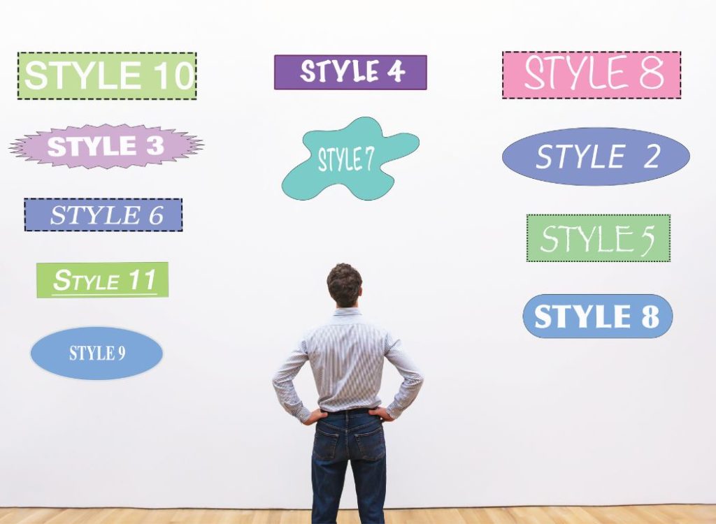
So, how exactly do fonts work their magic? Let’s delve into the psychology of fonts and explore how different styles can trigger specific emotions.
Check more: Fortnite font generator
What is the psychology behind fonts?
The psychology of fonts explores the subtle ways that different typeface designs can influence our emotions and perceptions. It’s like a silent language that goes beyond the literal meaning of the words themselves. Here’s a deeper dive into this fascinating topic:
Serif vs. Sans-serif:
Serifs are the small decorative lines attached to the ends of letters. Serif fonts, like Times New Roman, project a sense of tradition, trust, and sophistication. Sans-serif fonts, like Arial or Helvetica, are cleaner and more modern, conveying a sense of simplicity and efficiency.
Script Fonts:
Flowy, cursive script fonts mimic handwriting and evoke feelings of elegance, creativity, and sometimes even a touch of playfulness. Imagine a vintage perfume ad compared to a child’s birthday invitation – both might use script fonts, but the emotions they evoke are quite different.
Decorative Fonts:
Ornate and decorative fonts can be visually interesting, but use them sparingly. They can be fun for headlines or short bursts of text, but can become overwhelming and hard to read in large blocks.
Size and Weight:
The size and weight of a font also play a role. Large, bold fonts grab attention and convey power or importance. Smaller, lighter fonts create a sense of subtlety or delicacy.
Understanding these emotional associations can be a powerful tool for designers, marketers, and anyone who wants to communicate effectively with their audience.
Here are some examples:
- A website promoting luxury furniture might use a serif font to convey a sense of heritage and quality.
- A children’s book publisher might choose a playful script font to engage young readers.
- A brand promoting a new, innovative product might use a sleek, sans-serif font to communicate a modern and forward-thinking approach.
Next time you encounter a piece of text, take a moment to notice the font choice. How does it make you feel? Does it complement the message being conveyed? By understanding the language of fonts, you can become a more discerning reader and a more impactful communicator.
Remember, fonts are a powerful tool. Use them wisely!
There’s no single “most emotional font” because emotions depend on the context. However, some fonts naturally lean towards certain feelings:
- Serif fonts for tradition, trust, and elegance.
- Script fonts for creativity, playfulness, and sometimes romance.
- Bold fonts for power, urgency, and importance.
What is the effect of fonts?
The effects of fonts are powerful. They can:
Fonts play a crucial role in shaping how we perceive and interact with written content. Here’s a breakdown of how fonts influence our perception and communication:
Influence Perception of Credibility:
The choice of font can influence our perception of the credibility of a message. For example, serif fonts, with their small decorative strokes at the end of characters, are often associated with traditional print media like newspapers and books. When used in a news article, a serif font can convey a sense of authority and credibility, making readers feel that the information presented is reliable and trustworthy.
Grab Attention:
Different fonts can grab attention in various ways. Large, bold fonts are particularly effective at making headlines or important information stand out. When scanning through a webpage or document, a headline in a bold font immediately draws the reader’s eye, making it more likely that they will stop and read the associated content. This technique is commonly used in advertising, where capturing attention quickly is essential.
Set the Mood:
Fonts also have the power to set the mood or tone of a piece of content. A playful script font, with its flowing and whimsical appearance, can make a website or design feel more lighthearted, fun, and inviting. Conversely, a clean and minimalist sans-serif font might convey a sense of professionalism and modernity. By selecting fonts that align with the desired mood or atmosphere, you can enhance the overall user experience and engage your audience more effectively.
Communicate Emotions:
Fonts can evoke specific emotions and feelings in readers. For example, a bold and assertive font might convey confidence and strength, while a delicate and elegant font could evoke feelings of sophistication and refinement. By understanding the psychological associations of different fonts, you can choose ones that resonate with your audience and communicate your message more effectively.
Conclusion:
Fonts are powerful tools for communication, capable of influencing perception, grabbing attention, setting the mood, and communicating emotions. By choosing the right fonts for your content, you can enhance its impact and ensure that your message resonates with your audience in the intended way.


